Greco-Roman Urn
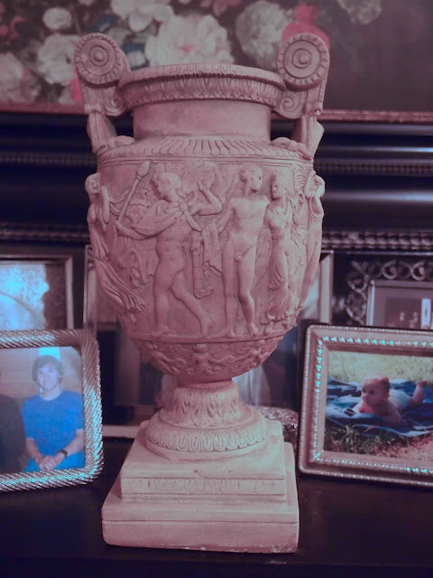
I'm the first to say I thought this was ugly and it is in a certain way. It has a garish quality that the nudes seems to accentuate and the material it's made from is less than desirable. BUT it is technically classical. It is a handled urn. It is in good condition. The most impressive thing about it is the image which wraps around the urn without repeating.
If it's plaster (most likely), then it's quite heavy and very cold to the touch. I don't think it's cement because it's too smooth and not heavy enough. The interior (hollow) is not clean in its texture. There are obvious areas inside that indicate it might have been made as a single piece in a form. I think it was poured and the emphasis was the design outside with the interior of the urn being the area that it was broken away from to spare stress to the design. An area of discoloration appears from top to base on the first picture. I think the form was split at this spot. The interior might have been a rough pour with the purpose of creating an interior which could sustain the weight and shape of the exterior, allow for a hollow interior, and allow the form to break away more easily from the exterior scene.
The details are wonderful. But they are so uniform, I doubt they are pressed in afterwards. I can't imagine much attention would have been given to emphasizing and touching up the lines. But the details are nice, plentiful, with much attention to the complete ornamentation from the base to the top, including an interior lip above the flawed, unsmooth interior.
It has potential: like where I'll potentially use it is completely beyond my imaginings at this point. BUT it was dirt cheap. And it was dirty, but I did wash it, but not so much as to remove the subtle shading that comes with stains that add a seeming patina of age. Yeah that's the word, patina, a word more valuable than what I paid for it. Now that I've defended it, I think I'll keep it. But where to put it?
It is photographed in my room amid my family pictures because the background is nice and the lighting was acceptable. It will not live here. It needs a home elsewhere in my home.
Designer Nancy Lancaster of Colefax & Fowler oft said that to complete a room one needed something a little bit ugly. Perhaps this will serve that purpose. But where to put it !?!


